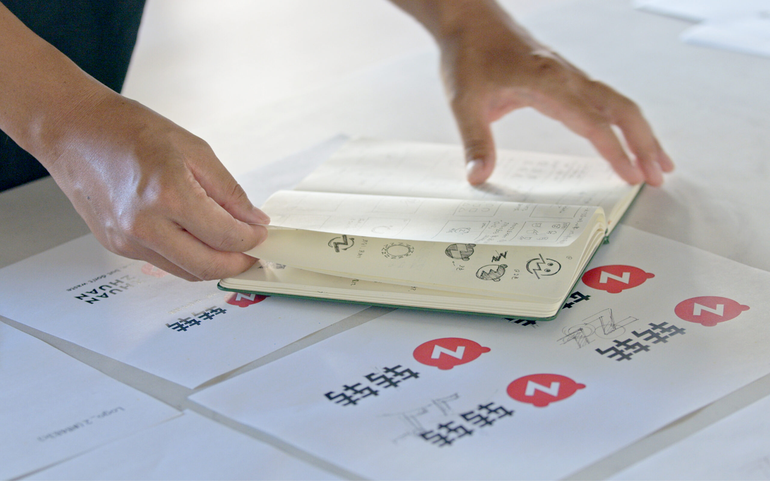
Design Concept
ZHUAN ZHUAN’s renewed design concept is Valuable Circulation. The logo, logotype, visual elements, fonts, colors, and application items have all been recreated to symbolize the value of an ecosystem of recycling, reuse and redistribution.
デザインコンセプト
デザインコンセプトはValuable Circulationです。 再利用・ 再分配の循環エコシステムから生まれる新しい価値をサービスの象徴として ロゴ、ロゴタイプ、ビジュアルエレメント、フォント、カラー、そしてアプリケーションの各種アイテムを制作しました。
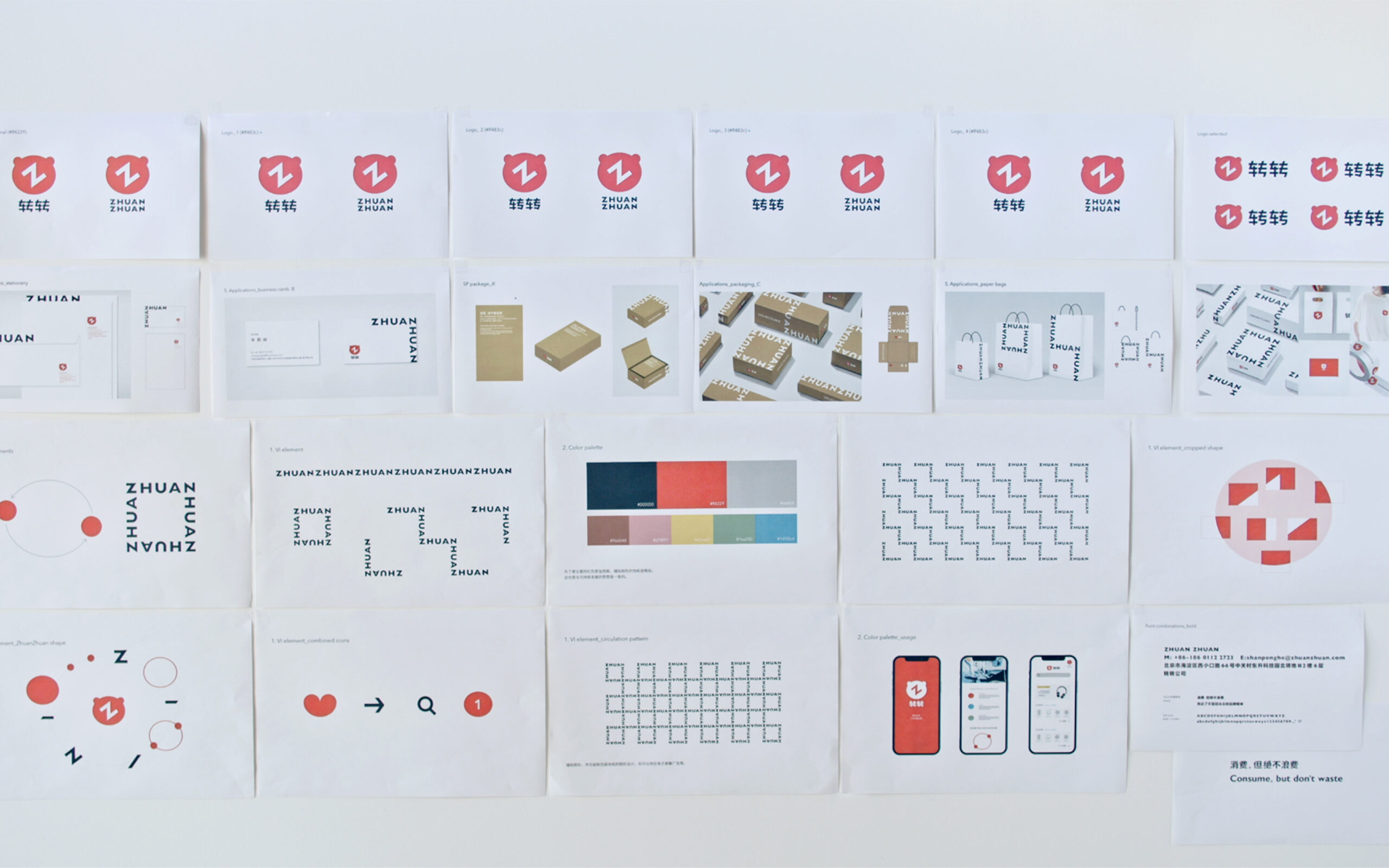
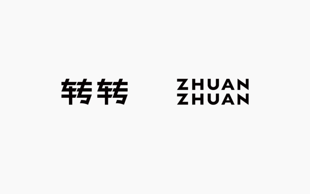
Logo type
The new logotype is composed of three powerful horizontal lines, a dynamic diagonal line that breaks up the three horizontal lines, and a soft curve with a humanistic quality to it. The sharp edges with gentle curves provide identification, visibility, and uniqueness. These edges are also adopted in the English typeface to create a consistent logotype.
ロゴタイプ
新しいロゴタイプは、力強く伸びる三本の水平線と、それを崩すような動的な斜線、そしてそこに人間性ある柔らかさを持った曲線によって構成されています。シャープなエッジに緩やかな曲線を取り入れて、識別性と視認性、そして独自性を実現しつつ、鋭角なエッジを英語にも踏襲することで、一貫性のあるロゴタイプとしました。
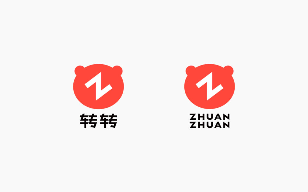
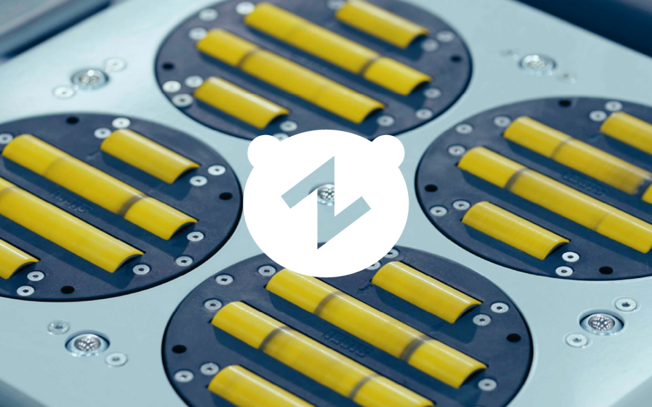
Symbol Mark
The symbol mark inherits the essence of the traditional bear mark, while the two circles represent a planet orbiting a satellite, expressing circulation. The Z in the center of the symbol mark is tilted at a 37-degree angle to dynamically express the strength of the company’s constant challenge.
シンボルマーク
シンボルマークは従来のクマのマークのエッセンスを取り入れつつ、2つの円が衛星軌道をまわる惑星に見立て循環を表現しています。更に中心に配置したZは 37度傾けることで常にチャレンジし続ける転転ならではの力強さを動的に表しています。
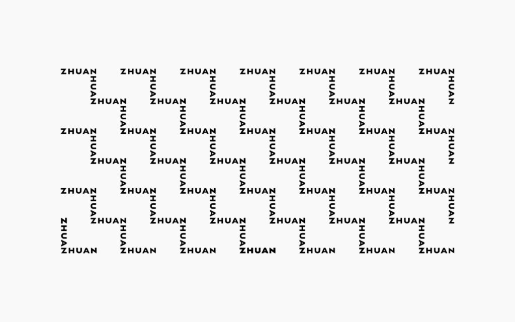
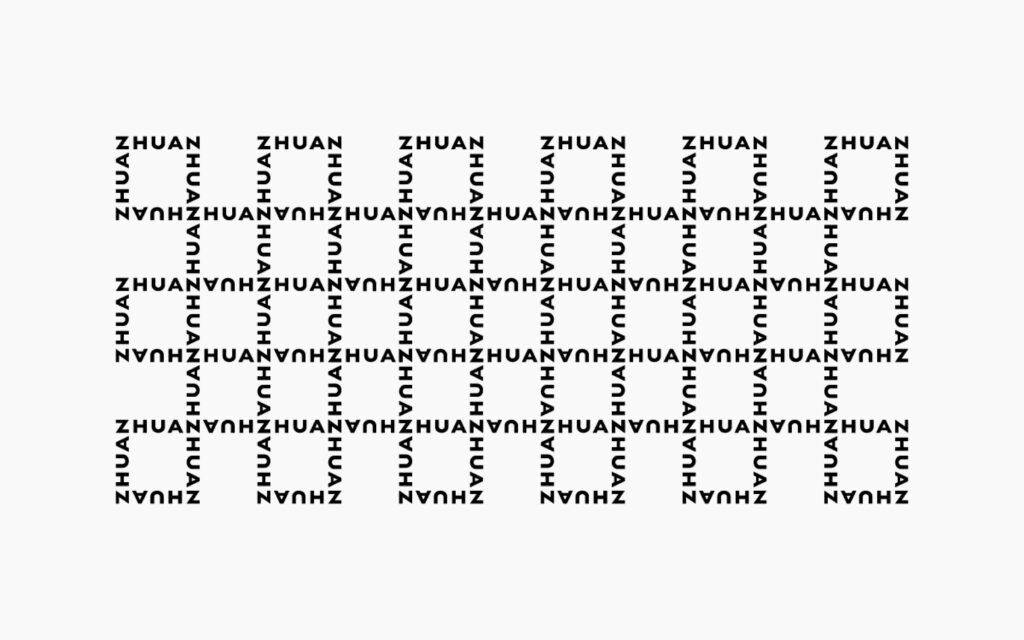
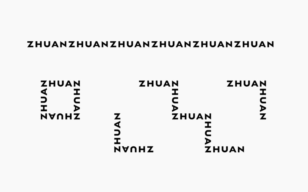
VI Element
The initial “Z” is rotated 90 degrees to form the letter “N”, to form a unique visual element. The infinite nature of the “Z” and “N” connecting, represents ZHUAN ZHUAN’s large scale vision in a playful and fun way.
VI エレメント
循環を想起させる独自のビジュアルエレメントでは、頭文字の Z を 90 度回転すると N になり、それが無限に繋がることで、転転の大きなビジョンを軽やかに楽しく、世の中に伝えていきます。
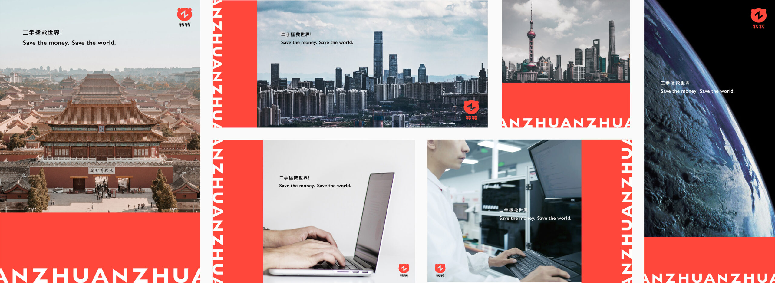
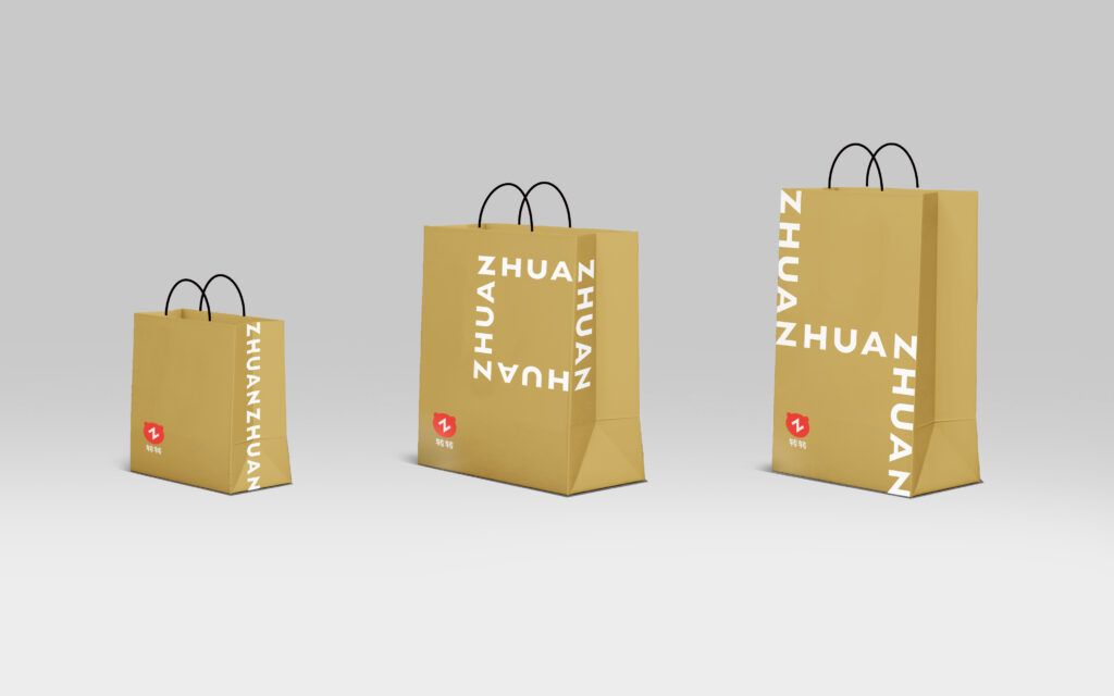
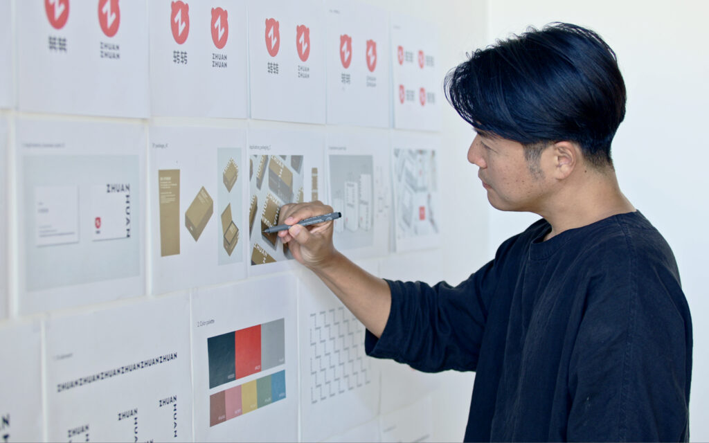
Application
ZHUAN ZHUAN’s unique visual identity representing circulation, has been deployed across several applications so that people have a clear understanding of its rebranding. Visual elements are consistently integrated into business cards, letterheads, packaging, advertisements, and all other items that come into contact with our customers.
アプリケーション
転転独自のビジュアルアイデンティティとして循環を想起させるエレメントは、 全ての人々にブレない転転のイメージをしっかりもっていただくためにダイナミックにあらゆるツールに展開しております。 名刺やレターヘッド、パッケージ、そして広告などお客様と接するすべてのアイテムにおいて一貫性をもって定着させました。